O'Really?

December 12, 2007

Mapping the Internet

Internet mapAs of 2007, the Internet is mostly still a wild untamed jungle. Many people have tried to chart the territory, but what should a map of the internet look like?

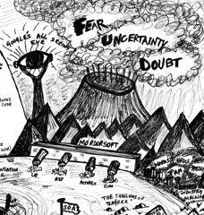
One of my favourite maps is “The Web Is Agreement” by Paul Downey. Paul’s map has a Tolkien-like Lord of the Rings feel to it, so instead of Microsoft we have Mordorsoft. The all seeing eye of Sauron is Google of course, helping search, but raising privacy concerns.

Paul is not the only cartographer busy drawing maps, Randall Munroe has drawn a nifty map based on Internet Protocol (IP) addresses (available as a poster, for hard-core geeks) and an online communities map, shown at the bottom of this post.

If the atoms of the Internet had numbers, you could organise them into a map like the Periodic Table, just as Mendeleev did. Hence we have The Periodic Table of the Internet by Wellington Grey, which uses PageRank (instead of atomic numbers) as a means of charting the Internet.

Periodic Table of the Internet

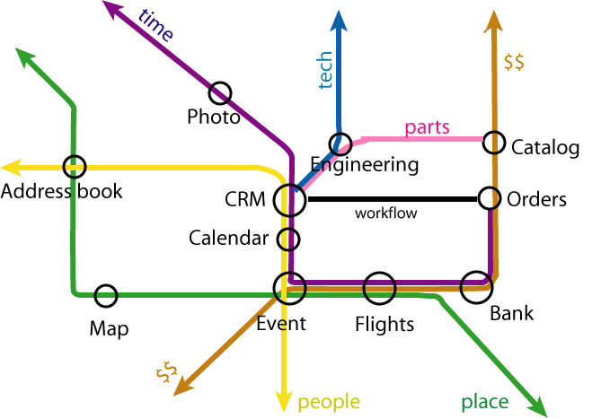
And of course there’s some bloke called Tim who, showing his British roots, often draws more abstract maps that look like the London Underground, shown below.

The map is not the territory but you can learn a hell of a lot by looking at the map before you head into the jungle. Using the map below, you’ll find nodalpoint, down South in the warm “blogipelago“, past the “Gulf of YouTube” below. Bon voyage!

May 31, 2007

Google Metabolic Maps

Google in the Palm of my HandThese days, new Google products and code seem to appear on a weekly basis. Take, for example, Google Gears which takes advantage of SQLite, mentioned on nodalpoint recently. They certainly don’t hang about at the Googleplex in Mountain View, California. Wouldn’t it be great if Google applied some of that engineering expertise and agility to science and bioinformatics? Just imagine: we could have Google Metabolic Maps, a virtual globe of the cell for scientists everywhere…

Scientists have been drawing metabolic maps for a very long time, but unfortunately when it comes to charting and understanding metabolic pathways, we’re still at the “here be dragons” stage of bio-cartography. I’m obviously not the first person to dream of this, but imagine maps of metabolic pathways looked more like Google Earth or Google Maps, than the old fashioned style maps, many life scientists will be familiar with. Now imagine just a little more, that these maps weren’t just available on conventional screens, but we’re given the Minority Report treatment, courtesy of Mr Bill Gates and his wizzy surface magic at Microsoft. Wouldn’t that be great? Metabolic maps on an interactive tabletop computer. Just like Tom Cruise in the movies, we’d be able to effortlessly swish around metabolism (or the metabolome / proteome / genome / [insert-your-favourite]ome). Imagine if it was all open-source too, no boundaries, no passports…

Now, you may say that I’m a dreamer, but I’m not the only one [1,2,3].

References

  1. Zhenjun Hu, Joe Mellor, Jie Wu, Minoru Kanehisa, Joshua M. Stuart and Charles DeLisi (2007) Towards zoomable multidimensional maps of the cell Nature biotechnology 25 (5), 547-54. DOI:10.1038/nbt1304
  2. Hiroaki Kitano, Akira Funahashi, Yukiko Matuoka and Kanae Oda (2005) Using process diagrams for the graphical representation of biological networks Nature biotechnology 23 (8), 961-6. DOI:10.1038/nbt1111
  3. John Lennon and Yoko Ono (1971) Imagine
  4. this post originally published on nodalpoint with comments

Creative Commons License

This work is licensed under a

Creative Commons Attribution-Noncommercial-Share Alike 3.0 License.


Blog at WordPress.com.